Another useful report provided by the OrdersTracker Dashboard is Sales by Categories. In this report, you can have an insight on sales generated against the products falling in specific categories.
To view the report, follow the steps below.
- Tap
 in the Top Bar.
A popup menu displays. - From the popup menu, tap Dashboard then select Sales by categories.

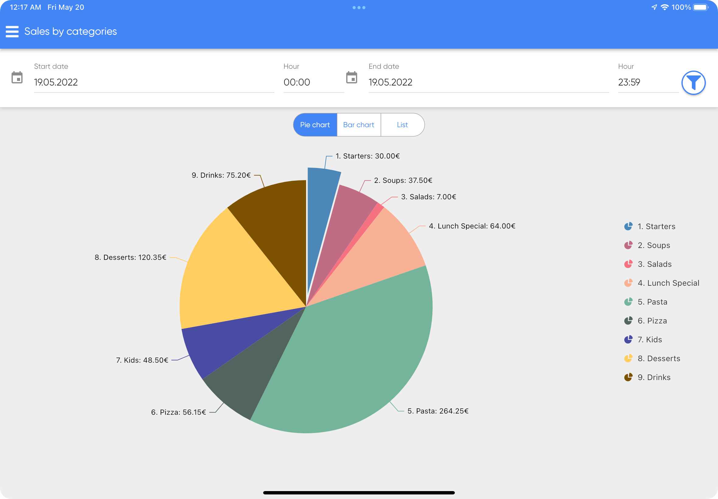
- You will be redirected to the page displaying the data of the current date. You can set the start and end date as you want. To learn more about filtering, please visit Adjusting Date Filters page. Also, there are three views you can choose from: Pie Chart, Bar Chart and List.
Pie Chart #
As displayed in the pie chart below, you can view the sales revenue according to different product categories within the specified period of date & time range.
Bar Chart #
Another view for sales by categories is represented in bar chart showing revenue against the product categories. It gives you a fair amount of idea to learn which category is being ordered/sold the most. For example, your top selling category as per bar chart below is Pasta.

List View #
List View provides you an option to view the data into more detail. You can search for the categories with the highest or lowest orders count along with the total price.
